> ## Documentation Index
> Fetch the complete documentation index at: https://docs.quick.bot/llms.txt
> Use this file to discover all available pages before exploring further.
# Analytics
In the **Analytics** section, you can view and analyze the performance of your bots.
Is the part of the product that tells you **how people are using your chatbots**, how
many saw them, how many actually talked to them, how many finished, where they gave up and what
answers they gave along the way.
Analytics is available on paid plans. On the free and personal plans the section appears locked,
with an option to upgrade.
## Key metrics
Everything in Analytics is built on three simple counts, measured over the period you choose:
* **Views**: how many times the chatbot was seen (loaded on a page).
* **Started**: how many people actually began a conversation.
* **Completed**: how many people reached the end of the conversation.
From those, the system calculates the rates that tell the real story:
* **Started Rate**: of everyone who saw the bot, what % started chatting.
* **Completion Rate**: of everyone who started, what % finished.
* **Drop-off Rate**: of everyone who started, what % quit before finishing.
## Filters
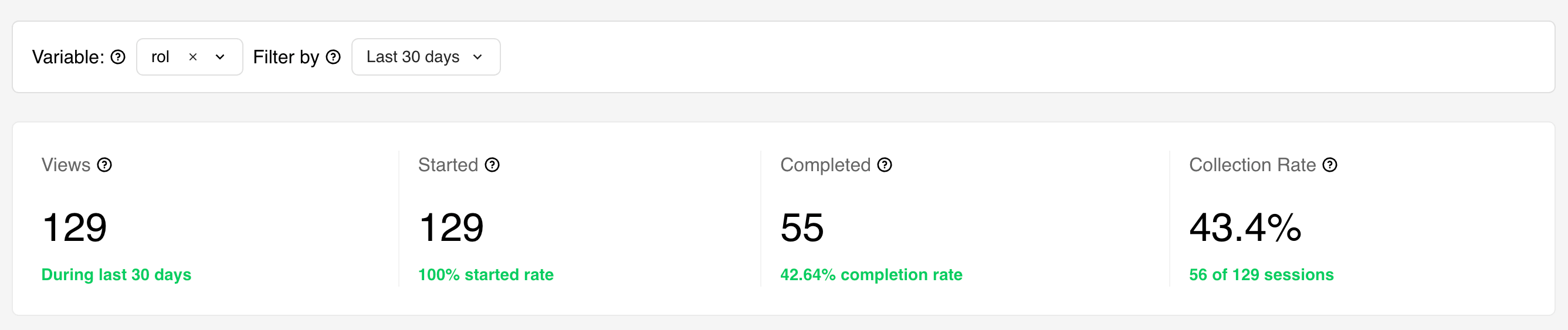
At the top of the page you have two filters that control everything below them:
* **Time filter**: choose the period you're looking at (e.g. today, last 30 days, year-to-date). Use
it to compare periods and spot trends.
* **Variable filter**: narrow the analytics down to a single piece of information your bot collects
(a "variable", such as budget, city, or plan). Selecting a variable here is what reveals the
**Collection metrics** section further down the page.
If your bot doesn't collect any variables, this filter won't appear.
## Summary cards
Shows **Total Views**, **Total Started**, and **Total Completed** for the period you picked, each
with its percentage underneath.
 ## Performance chart
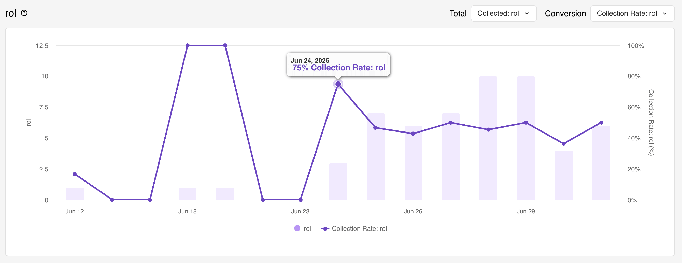
A bar-and-line chart showing how those numbers move **day by day**. The bars show a raw count (e.g.
views per day) and the line shows a rate (e.g. completion rate %). You can switch which metric each
shows using the two dropdowns. This is where you spot trends — a good day, a bad week, the effect of
a marketing campaign.
## Performance chart
A bar-and-line chart showing how those numbers move **day by day**. The bars show a raw count (e.g.
views per day) and the line shows a rate (e.g. completion rate %). You can switch which metric each
shows using the two dropdowns. This is where you spot trends — a good day, a bad week, the effect of
a marketing campaign.
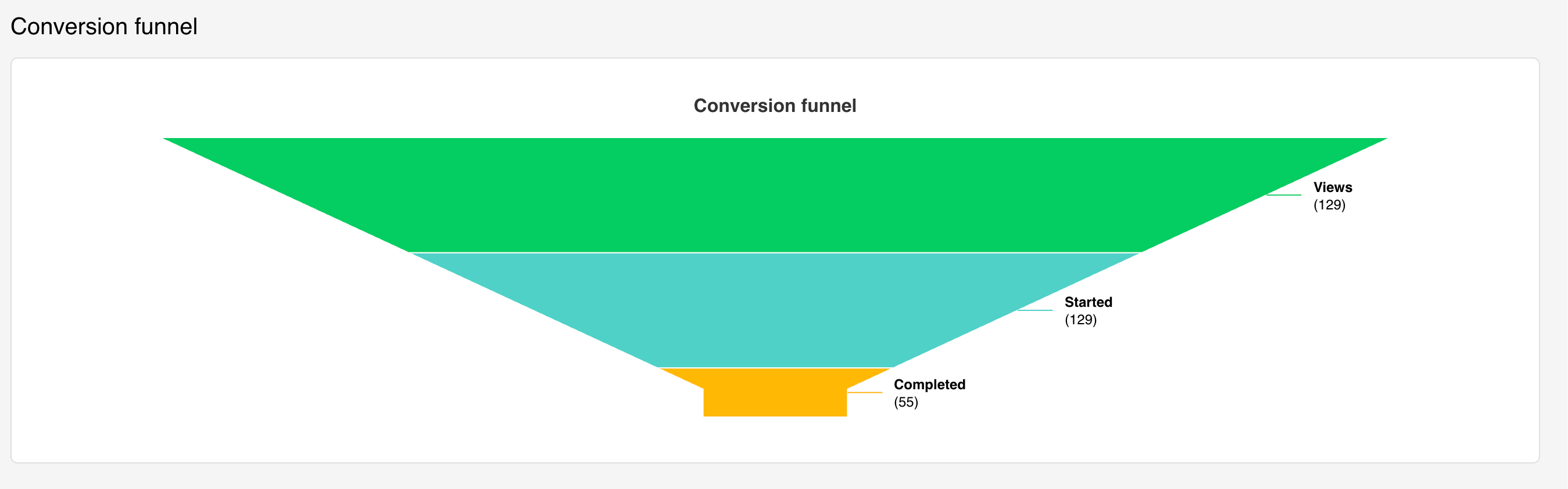
 Here you can see the total number of views, started sessions and sessions completed.
## Conversion funnel
A funnel-shaped picture that stacks **Views → Started → Completed** on top of each other so you can
see how many people fall away at each step. A funnel that narrows sharply tells you exactly where
you're bleeding potential customers.
Here you can see the total number of views, started sessions and sessions completed.
## Conversion funnel
A funnel-shaped picture that stacks **Views → Started → Completed** on top of each other so you can
see how many people fall away at each step. A funnel that narrows sharply tells you exactly where
you're bleeding potential customers.
 ## Collection metrics
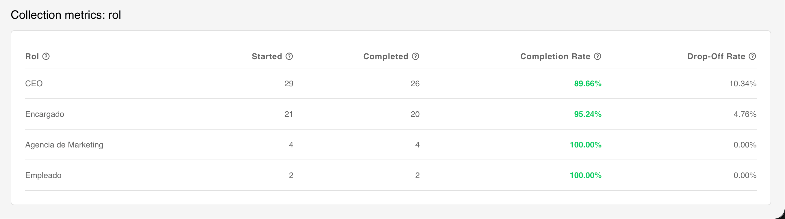
When you select a variable in the **Variable filter** at the top of the page, a **Collection
metrics** section appears below the conversion funnel.
## Collection metrics
When you select a variable in the **Variable filter** at the top of the page, a **Collection
metrics** section appears below the conversion funnel.
 Variable analytics lets you:
* See the **collection rate**: of the people who started, how many actually gave you that piece of
info?
* Break results down **by answer**: e.g. for the question "What's your budget?", see how many chose
"low / medium / high" and — crucially — the completion rate *for each group*. Maybe "high budget"
people finish 90% of the time and "low budget" people quit early. That's a real business insight.
* For numeric answers, see the **average value** (e.g. average budget entered).
The section includes a table with one row per answer, and these columns:
| Column | What it means |
| ------------------- | --------------------------------------------------------------------------- |
| **\[Variable]** | Each different answer people gave (e.g. "Low", "Medium", "High"). |
| **Started** | How many people started the bot and ended up with this answer. |
| **Completed** | How many of those people finished the whole conversation. |
| **Completion Rate** | Of the people who gave this answer, what % finished the bot. |
| **Drop-off Rate** | Of the people who gave this answer, what % started but quit before the end. |
The **Completion Rate** is color-coded so you can scan it at a glance:
* 🟢 **Green**: 75% or higher (this group finishes well).
* 🟠 **Orange**: 50 to 74% (mediocre).
* 🔴 **Red**: below 50% (this group is dropping off).
Analytics can also show **combined numbers across all of your bots at once**, not just one bot at a
time. Use it for a workspace-wide pulse-check, then drill into an individual bot for detail.
## Examples
### 1. Business type (button choice)
Suppose your bot asks visitors what kind of business they run and offers **three options as
buttons** — for example *Retail*, *Services*, and *Manufacturing* — saved into a variable such as
`businessType`.
Select that variable in the **Variable filter**, and the **Collection metrics** section shows you:
* The **collection rate**: of everyone who started, what % actually picked a business type. If this
is low, the question may be appearing too late or feel intrusive.
* The **percentages table**, one row per option, so you can compare how each segment behaves:
| businessType | Started | Completed | Completion Rate | Drop-off Rate |
| ------------- | ------- | --------- | --------------- | ------------- |
| Retail | 420 | 357 | 🟢 85.0% | 15.0% |
| Services | 310 | 186 | 🟠 60.0% | 40.0% |
| Manufacturing | 130 | 52 | 🔴 40.0% | 60.0% |
At a glance you can see that *Retail* visitors finish well, while *Manufacturing* visitors are
dropping off — a signal that the flow after that choice needs work for that segment.
### 2. Rating at the end of the conversation (1 to 5)
Now suppose the **last step** of your bot asks people to rate their experience from **1 to 5**,
saved into a variable such as `rating`.
Because this is the final question, its **collection rate closely mirrors your completion rate** —
only people who reach the end can leave a rating, so "how many gave a rating" and "how many finished
the conversation" are almost the same number. It's a useful sanity check that the two line up.
Since the answers are numeric, the Collection metrics also show the **average value** — your average
rating across all sessions (e.g. `4.3`). Watch this number over time: if it drops after you change
the flow, your latest version is landing worse with users.
Variable analytics lets you:
* See the **collection rate**: of the people who started, how many actually gave you that piece of
info?
* Break results down **by answer**: e.g. for the question "What's your budget?", see how many chose
"low / medium / high" and — crucially — the completion rate *for each group*. Maybe "high budget"
people finish 90% of the time and "low budget" people quit early. That's a real business insight.
* For numeric answers, see the **average value** (e.g. average budget entered).
The section includes a table with one row per answer, and these columns:
| Column | What it means |
| ------------------- | --------------------------------------------------------------------------- |
| **\[Variable]** | Each different answer people gave (e.g. "Low", "Medium", "High"). |
| **Started** | How many people started the bot and ended up with this answer. |
| **Completed** | How many of those people finished the whole conversation. |
| **Completion Rate** | Of the people who gave this answer, what % finished the bot. |
| **Drop-off Rate** | Of the people who gave this answer, what % started but quit before the end. |
The **Completion Rate** is color-coded so you can scan it at a glance:
* 🟢 **Green**: 75% or higher (this group finishes well).
* 🟠 **Orange**: 50 to 74% (mediocre).
* 🔴 **Red**: below 50% (this group is dropping off).
Analytics can also show **combined numbers across all of your bots at once**, not just one bot at a
time. Use it for a workspace-wide pulse-check, then drill into an individual bot for detail.
## Examples
### 1. Business type (button choice)
Suppose your bot asks visitors what kind of business they run and offers **three options as
buttons** — for example *Retail*, *Services*, and *Manufacturing* — saved into a variable such as
`businessType`.
Select that variable in the **Variable filter**, and the **Collection metrics** section shows you:
* The **collection rate**: of everyone who started, what % actually picked a business type. If this
is low, the question may be appearing too late or feel intrusive.
* The **percentages table**, one row per option, so you can compare how each segment behaves:
| businessType | Started | Completed | Completion Rate | Drop-off Rate |
| ------------- | ------- | --------- | --------------- | ------------- |
| Retail | 420 | 357 | 🟢 85.0% | 15.0% |
| Services | 310 | 186 | 🟠 60.0% | 40.0% |
| Manufacturing | 130 | 52 | 🔴 40.0% | 60.0% |
At a glance you can see that *Retail* visitors finish well, while *Manufacturing* visitors are
dropping off — a signal that the flow after that choice needs work for that segment.
### 2. Rating at the end of the conversation (1 to 5)
Now suppose the **last step** of your bot asks people to rate their experience from **1 to 5**,
saved into a variable such as `rating`.
Because this is the final question, its **collection rate closely mirrors your completion rate** —
only people who reach the end can leave a rating, so "how many gave a rating" and "how many finished
the conversation" are almost the same number. It's a useful sanity check that the two line up.
Since the answers are numeric, the Collection metrics also show the **average value** — your average
rating across all sessions (e.g. `4.3`). Watch this number over time: if it drops after you change
the flow, your latest version is landing worse with users.